ADR UK: New funding, new look
Categories: Blogs, ADR England, ADR Northern Ireland, ADR Scotland, ADR Wales, YDG Cymru, ADR UK Partnership
20 March 2026
In today's blog, ADR UK's Head of Communications and Engagement, Holly Greenland, shares a behind-the-scenes look at the ADR UK brand refresh, along with a sneak peak of our new national logos and colours.
New opportunities for our new investment period
2025 was an exciting year at ADR UK, with our new investment confirmed by UK Research & Innovation last summer.
With five years of further funding, the team have big ambitions for the programme: from expanding our research fellowships across the four nations, to launching new economic datasets which can unlock even more policy-relevant insights.
Alongside this growth, we’ve taken the time to review our own brand and visual identity, asking ourselves: what are we known for? Who are we now? And does our identity support where we are going?
Rebranding the rebrand…
The rebranding process was designed as a collaborative project. Over a series of months, the ADR UK Communications & Engagement team worked closely with designers and ADR UK colleagues from across the UK-wide national partnerships through phases of review, development and refinement.
To kick off, we wanted to explore how our visual identity had worked to date, including its strengths and limitations. This showed us that our ADR UK teal colour had high recognition with researchers and wider data programmes. Similarly, the interconnecting circles in our logo did a good job indicating our specialism in linking data in new ways. It was clear that brand recognition had come a long way from when we launched the pilot ADR UK programme to now and this would remain a central focal point as we thought about what could come next.
But… there were some areas where our brand could work harder. Our focus on one primary colour limited our ability to tell complex stories, creatively represent multiple data points and differentiate the national identities across our partnership. The challenge became how we could stretch the brand to meet these new needs while remaining visually unifying and true to the identity we had already created.
From the start, accessibility was also at the heart of our discussions, which caused us to take a critical look at where we may have been falling short. Our use of grey for much of our text and logo, for example, came under scrutiny as it can have low contrast on light colours making it harder for many to read.
Finally, there was an opportunity to emphasise one of the unique selling points of our programme: four individual national entities, unified under one partnership. ADR UK utilises both UK-wide data, and datasets focused on the four UK nations. This offers researchers the chance for targeted analysis and policy impact designed for the nuances of each nation.
So, although a full rebrand was felt a step too far, what we renamed a ‘brand extension’ was still on the cards.
Setting our principles
Working collaboratively with design agency, Luna9, and representatives from across the ADR UK partnership, we identified four principles to keep the project on track.
It must:
- Be cost-effective: the process and all outputs must ensure public value.
- Be holistic: a new extended colour palette should work separately for each national partner and – critically – work together.
- Be accessible: accessibility must be at the forefront of all our decisions.
- Retain brand recognition: the recognisable teal and circular shapes should be retained but expanded.
This set us on the right path, and in a fairly speedy three-month period we are delighted to have delivered a refreshed and extended brand across our partnership.
What’s happening now?
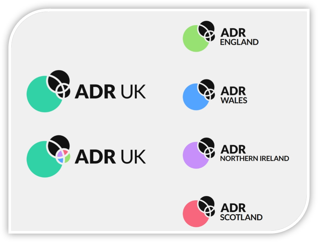
Today we are releasing our new ADR UK logo for the first time!
You may notice that our teal is now brighter, the old grey has gone, and we’ve tightened up the type face.
From today, you can see the ADR UK refreshed brand begin to be in use across all our channels, and can explore it first on our website: adruk.org
And not only that, today you get a sneak peak at the logos and colours for our national identities. These will be rolling out fully in the coming months.
Looking to the future…
We will be launching each national partner visual identity - England, Northern Ireland, Scotland and Wales - over the next few months, with brand new microsites going live to mark each launch.
You’ll see that each national partner will be represented by not only their own colour, but also a distinctive new pattern for each nation, all inspired by data with nods to the original ADR UK brand.
So, see if you can spot changes across all our national partners, as we deliver our phased roll out this spring.
Any questions?
Get in touch if you want to find out any more about our brand extension.